Alt Text Writing, Kalai Selvi Arivalagan [books to read to increase intelligence txt] 📗

- Author: Kalai Selvi Arivalagan
Book online «Alt Text Writing, Kalai Selvi Arivalagan [books to read to increase intelligence txt] 📗». Author Kalai Selvi Arivalagan
Shape adjectives
Broad, chubby, crooked, curved, deep, flat, high, hollow, low, narrow, round, shallow, skinny, square, steep, straight, wide
Size adjectives
Big, colossal, fat, gigantic, great, huge, immense, large, little, mammoth, massive, miniature, petite, puny, scrawny, short, small, tall, teeny, teeny-tiny, tiny
Sound adjectives
Cooing, deafening, faint, hissing, loud, melodic, noisy, purring, quiet, raspy, screeching, thundering, voiceless, whispering
Time adjectives
Ancient, brief, early, fast, late, long, modern, old, old-fashioned, quick, rapid, short, slow, swift, young
Taste/touch adjectives
Bitter, delicious, fresh, greasy, juicy, hot, icy, loose, melted, nutritious, prickly, rainy, rotten, salty, sticky, strong, sweet, tart, tasteless, uneven, weak, wet, wooden, yummy
Touch adjectives
Boiling, breeze, broken, bumpy, chilly, cold, cool, creepy, crooked, cuddly, curly, damaged, damp, dirty, dry, dusty, filthy, flaky, fluffy, freezing, hot, warm, wet
Quantity adjectives
Abundant, empty, few, full, heavy, light, many, numerous, sparse, substantiable
List of Descriptive Words to Critique Art
Many words are there that can help you be descriptive when it comes to writing Alt text on art. In fact, there are words to comment on every single aspect of art. The line, tone, movement, texture and shape are ways in which art can be explained.
Six Words to Critique Line
In art a line can be described in several things. The words used to describe line in the form of art are everyday type of words, nothing fancy.
Flowing, delicate, simple, bold, thick, thin
Four Words to Critique Tone
When it comes to tone in art, four words can help you when critiquing. None of the words are fancy; however they may not all be use in your everyday conversations with friends.
Subtle, Contrasting, Muted, Dramatic
Five Words to Critique Texture
Texture is a very common element with and often used when referring to clothing, furniture and hair. Also, if you have ever painted a wall in your home you are most likely familiar with the following words.
Rough, Fine, Smooth, Coarse, Uneven
Five Words to Critique Shape
Art comes in various shapes whether it is a painting or a sculpture. Therefore, there are specific words to describe each piece of art.
Organic, Curvaceous, Geometric, Angular, Elongated
Three Words to Critique Movement
Movement is seen in every piece of art. Movement helps to create or define a piece of art.
Swirling, Flowing, Dramatic
Five Words to Critique Scale
Scale is basically the size of the art. The words used to critique scale are common words that are already in our vocabulary.
Large, Small, Intimate, Miniature, Monumental
Three Words to Critique Contrast
Two out of the three words for contrast have already been used to critique other elements of art. Therefore, it should not be hard to remember these words on a list of descriptive words to critique art. The only other word you need to remember here is the word strong and that is a common word.
Dramatic, Subtle, Strong
Six Words to Critique Color
In art color is very important. This is what helps each piece of art stand out. The color, no matter what type of artwork helps define the piece and the artist. A lot of artwork can be determined on who did the work just by looking at the colors, because certain artists use specific colors in every piece of their work.
Bold, Vibrant, Subtle, Pale, Earthy, Naturalistic
List of Descriptive Words to Critique Art
Saturation- refers to the brightness of color
Geometric – refers to the shapes such as circles, triangles, squares, etc.
Organic – free flowing or rounded
Symmetry – meaning it is equal on both sides
Asymmetrical – unequal proportioned elements
Flat tones – no tonal effect in the color
Negative space – the space around the actual form of art
Depth – the illusion of space
Broken color – dabs or small amounts of color
Focal point – the spot that stands out in the artwork
Distorted – a shape that is changed, and no longer looks proportioned
Decorative Images


Graphs
The real challenge lies in interpretation of graphs and write Alt text for them. If the graphs are simple, it is much easier. But if you find more than one curve on the graph or too many data to interpret, then it becomes a challenge. You need to use your power of reasoning to interpret.
How to interpret line graphs
Line graphs show time series data for more variables vary over a continuous period of time.
Line graphs are particularly useful for identifying patterns and trends in the data such as seasonal effects, large changes and turning points. Line graphs can also be appropriate for displaying data that are measured over other continuous variables such as distance.
For example, a line graph can be used to show how pollution levels vary with increasing distance from a source, or how the level of a chemical varies with depth of soil.
In a line graph the x-axis represents the continuous variable (for example year or distance from the initial measurement) whilst the y-axis has a scale and indicates the measurement. Several data series can be plotted on the same line chart and this is particularly useful for analyzing and comparing the trends in different datasets.
MapsWriting Alt text for maps is also quite interesting and challenging.
When we do alt text on maps, we need not include names of countries on a world map that shows borders but not provide country names. We need not include state names on alt text for a map of the United States that shows borders but not provide state names. Writing alt text like that is laborious and time-consuming.
World maps have more general alt text, "A world map shows that most countries with rates of less than 5 percent or 5 to 15 percent of cesarean births are in central and southern Africa, the Middle East, and southeast Asia. Countries with rates of 15 to 30 percent include many in Western Europe as well as Canada, Russia, and China. Countries with rates above 30 percent include some in Western Europe as well as the United States, Mexico, Brazil, and Australia."

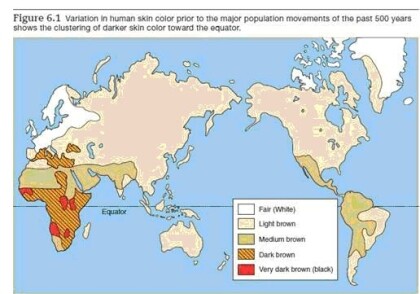
Short alt text: An unlabeled world map shows variation in five human skin colors across continents.
Long alt text: The general locations of the skin colors are as follows: Fair (White): Northern Europe, Scandinavia, Greenland, Arctic. Light brown: The dominant overall color, covering most of Europe, Asia, North America, Australia, and eastern South America. ·Medium brown: Central America, western South America, a belt across northern Africa into the Middle East. · Dark brown: Most of central and southern Africa. Very dark brown (black): Pockets in central and southern Africa.
Bar charts
Horizontal bar charts
Bar charts are normally drawn in vertical which means that the taller the bar, the larger the category. However, it is also possible to draw in horizontal which means that the longer the bar, the larger the category. This is an effective way of presenting data when different categories have long titles that would be difficult to include below a vertical bar, or when there are a large number of different categories and there is insufficient space to fit all the columns required for a vertical bar chart across the page.
Grouped bar charts
Grouped bar charts help to give information about different sub-groups of the main categories. Grouped bar charts can be used to show several sub-groups of each category but care needs to be taken to ensure that the chart does not contain too much information making it complicated to read and interpret. Grouped bar charts can be drawn as both horizontal and vertical charts depending upon the nature of the data to be presented.
Stacked bar charts
Stacked bar chars are similar to grouped bar charts in that they are used to display information about the sub-groups that make up the different categories. In stacked bar charts the bars representing the sub-groups are placed on top of each other to make a single column, or side by side to make a single bar. The overall height or length of the bar shows the total size of the category whilst different colors or shadings are used to indicate the relative contribution of the different sub-groups.


Comments (0)